Resources
A compendium of helpful tools.
Here to Help!
As Perfectly Pitched embarks on a new chapter, it’s been bittersweet to have to put a pause on our consulting work as we undertake a grand new plan to automate our unique branding, marketing, & pitching methods. We don’t want to leave any founders stranged, though! Thus we’ve taken the time to pull together some of our favorite helpful resoures out there on the great wide interwebs! Much of this comes from — or builds on top of — materials in the classes we provide for our various startup ecosystem partners. But I’ve added on quite a few new things as well, especially an entire section of advice about how to overcome the inevitable nerves that arise right before a big important pitch presentation. Believe me, I’ve been there! I’ll share what I did to try to get over it and get the most out of every pitch opportunity.
I hope you find this helpful! In the meantime, please feel free to sign up for our Consulting Services Wait List below. That way you can be the first to hear when we finally have some time open back up on our calendars to provide one-on-one support once again.
Good luck & Happy Pitching!


Pitch Software & Zoom Tips
This section will cover all your software needs when it comes to presenting. We’ll start with a quick overview of the various software options available to you for making pitches, then jump into how to maximize your use of that software when you’re presenting in online meetings like over Zoom! I’ll also try to give an overview of features that are available and how they can help you create even better pitch decks.
Obviously, so much of what software you choose depends upon both what operating system your computer uses, along with your budget. There are options here from free to $30 per month, so you’re sure to find something that’ll work for you!
1 • Keynote
OS: Mac
Cost: Free with any Mac
Favorite Features
- Super easy & intuitive to use.
- High quality animations & transitions.
- Tons of customization features, helping you do just about anything you could possibly want to do.
- Excellent design guidance, with pop up guides that track margins, as well as optional “snapping” to center and edge margins.
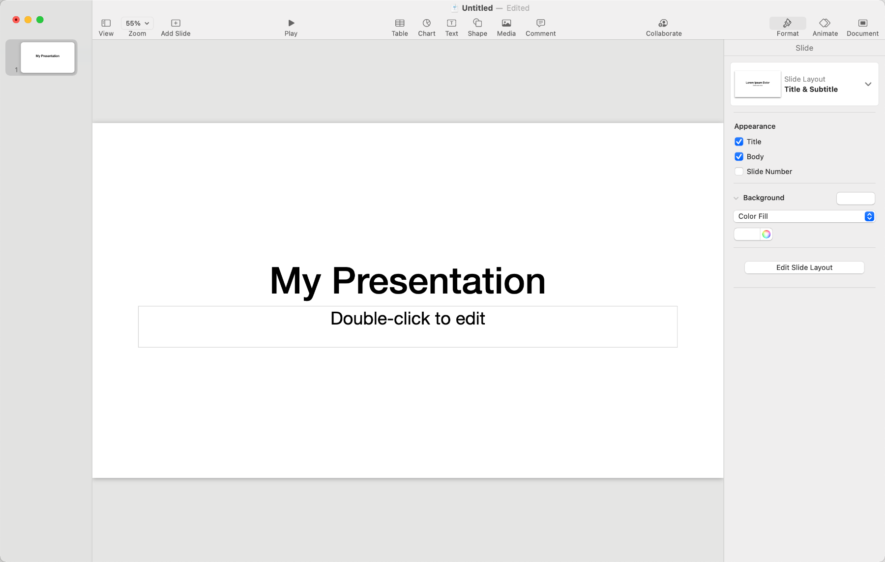
- Built-in presentation recording with synced audio narration, creating high quality videos. If you want to see what’s possible beyond just pitches, check out the Halcyon partnership page & scroll to the bottom. I made the video you’ll find there… in Keynote!
- Its Presenter View is easily the best in the industry! Scroll down to see examples. Or you can also use a wirelessly connected iPhone or iPad as a remote & note viewer!
Connectivity:
- You can collaborate with others, and they don’t even need to be on Mac. If you upload the file to iCloud, others can access it via their web browser at www.iCloud.com.
Exportability:
- Can export to PDF, PowerPoint, HTML, and export any recordings as movie files!
2 • PowerPoint
OS: Windows/Mac
Cost: Starts at $6.99/mo
Favorite Features
- It has LOTS of features, can do just about everything Keynote can. But I find its interface clunky, confusing, and obnoxious.
- I do like that it has some automatic alignment features, but I often find the automatic margins tend to be too cramped.
- I do like that the app version is available on both Mac & PC; I wish Keynote would do the same!
Connectivity:
- Can collaborate with multiple other people.
Exportability:
- Can export to PDF.
- Link Keynote, you can also record your pitch within the software and export it as a movie.
3 • Canva
OS: Web-based
Cost: Freemium • $119/year
Favorite Features
- I love that it makes design easy for people new to design.
- It has a whole wealth of free stock images, illustrations, icons, and resources built into the platform, so it’s easy to search, drag, and drop.
- Their presentation recording feature is fantastic! It not only records your slides and narration, but also records your face if you have a camera connected. It’ll then deposit you in a cute little bubble in the lower lefthand corner. Very slick!
Connectivity:
- Can collaborate with multiple other people.
Exportability:
- Can export to PDF, PNG, JPG, GIF, MP4, SVG (Premium only)
What I Wish It Had:
- I used to wish they had precise item placement options, but guess what? They added that feature! It can be a little difficult to find though, but it is there finally!
4 • Google Slides
OS: Web-Based
Cost: Free
Favorite Features
- Super easy to collaborate with others.
- Love that it’s truly free.
What I Wish It Had:
- Kerning! It has very, very, very little in the way of text customization, which makes it very difficult to create truly dynamic slides. It frustrates me to no end just how limited your creativity becomes when you don’t have basic customization tools.
Connectivity:
- You can collaborate easily with others, at the same time, which is nice.
Exportability:
- Can export to PDF, PowerPoint, JPG, PNG, SVG, and Plain Text.
5 • Adobe InDesign
OS: Windows/Mac
Cost: Starts at $19.99/mo for students, $59.99/mo otherwise
- Simply too prohibitively expensive for most early stage social entrepreneurs.
- A lot of professionals use InDesign for magazines, books, flyers, etc. So it’s definitely super powerful, just has a price tag to match!
- InDesign was created specifically for high quality professional print design, like magazine layouts and books. It’s fantastic for print layout, meaning you can arrange items and print them without losing any image quality. But its UI/UX is designed for professionals, which means it has a rather steep learning curve. Overall it just wasn’t designed for creating pitch decks, so I don’t recommend it.
6 • Adobe Acrobat Pro
OS: Windows/Mac
Cost: $19.99/mo for students, otherwise $59.99/mo
- I don’t know why you’d use this. It has exceedingly limited features for specifically creating presentations! Plus, pretty much every other option exports to PDFs.
- Acrobat is, however, great for compressing exported pitch PDfs! Adobe has a totally free Acrobat PDF Compressor service online. So if you create your deck in Keynote, PowerPoint, Canva, or Google Slides, you can export it to PDF from there. (Keynote lets you control image quality when exporting to PDF; I typically recommend Best quality, but Better is okay too.) If your exported PDF ends up too large of a file size, head to Acrobat Online to compress it. Their online version does a great job of retaining image quality while still minimizing file size.

Pitch Online Like a Pro
I’ve fielded so many questions from entrepreneurs about how best to present their pitches over Zoom, engaging with the audience virtually, while still juggling access to your script notes.
First off, not many founders realize that Power Point, Keynote, Canva, and Google Slides all offer incorporated script notes. Why put your script in there? Because if you have a second monitor, that means you can view your full script as you present! All you have to do is set up your presentation software to display your script notes on your main monitor (or wherever you webcam is set up), and display your actual slide presentation on the second monitor. When you share your screen in the meeting, share only that second monitor. That way your audience will see your beautiful slides, while you can look straight at the web cam, appearing engaged with your audience, while no one realizes your script is right in your eyeline. (But of course, don’t fall into the trap of reading with a monotone voice. Don’t forget to emote!)
But what if you don’t have a second monitor? Don’t worry! I’ll share inexpensive solutions — some as cheap as $5 — to solve this problem & get you presenting online like a pro!
What You See
Your Main Monitor View
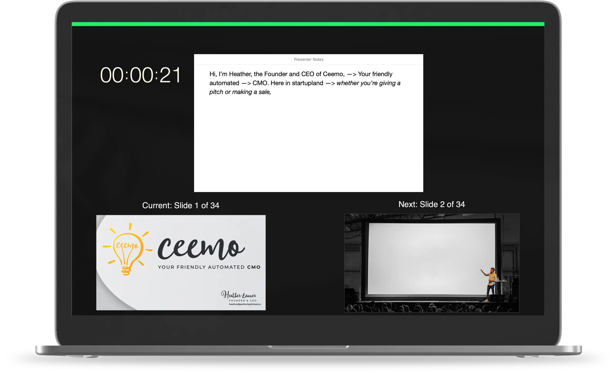
Here’s what Keynote’s Presenter Display looks like! Power Point, Google Slides, and Canva all offer similar presenter views (though, in my opinion, Keynote’s is best.) If you set your software to display Presenter View on your main monitor — or rather, whichever monitor is directly below your webcam — you can see your notes, which slide you’re on, which slide’s coming up next, and how much time has elapsed, all while still looking like you’re engaging with your audience via the webcam.
What They See
Shared Second Monitor
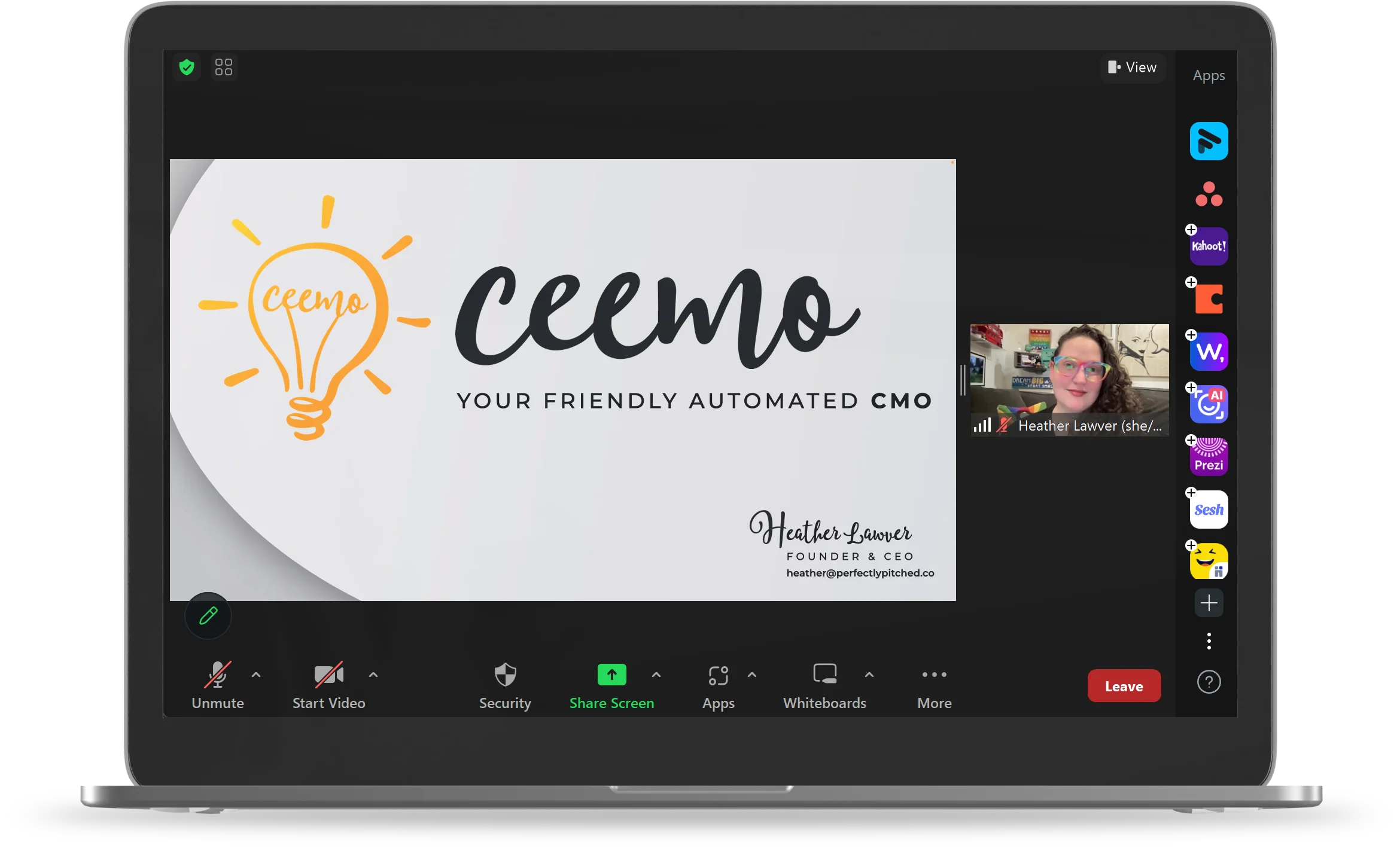
Meanwhile on Zoom, you can share your second monitor. That means all the audience will see is your beautiful slides & your beautiful face! They’ll have no idea that you can actually see all of your notes, helping you stay on track, on topic, and presenting like a pro. But again, just make sure you don’t fall into the trap of sounding like you’re reading. Remember to speak with passion and a natural rise and fall to your vocal inflections.

Only Have One Monitor?
This is the moment when I inevitably hear from a founder, “This all sounds great, but… what if I only have one monitor?” Don’t worry, I got you! There are plenty of solutions out there to fit any budget! In fact, my favorite solution can cost less than $5.
I’m not being paid to recommend these products and I bought them with my own money. I will, however, get a small percentage if you purchase one through one of the links below. But please feel free to buy them wherever you like!
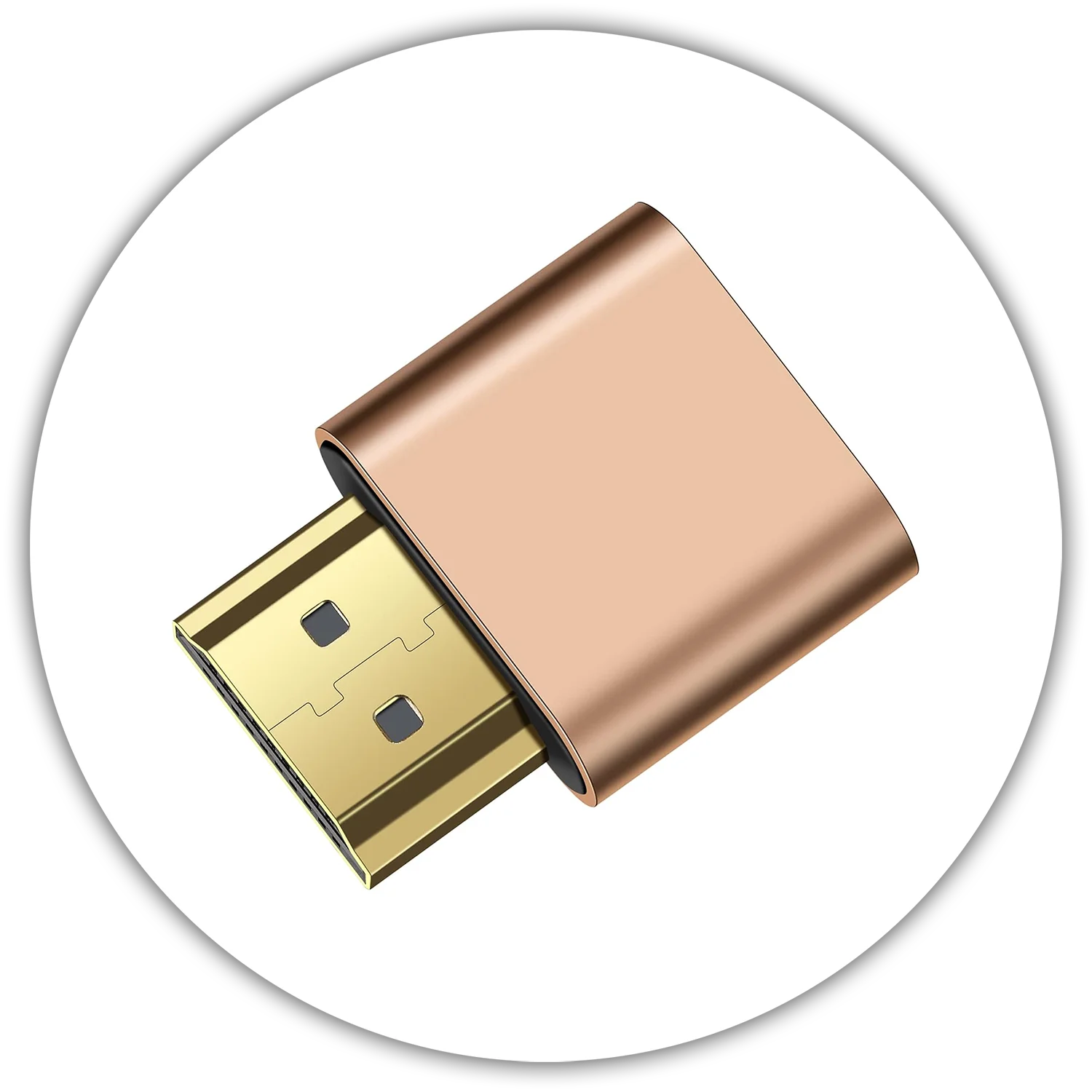
Virtual Second Monitor
Simply plug this tiny dongle into your computer & it will create a virtual monitor for you! You can select it like normal when sharing your screen on Zoom. Best of all, they can cost as little as $5! I bought a 3-pack of this exact model on Amazon, but feel free to explore & find whichever option works best for you!
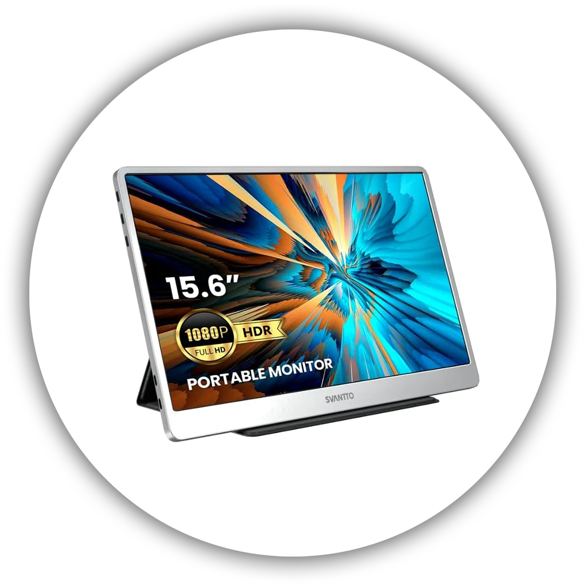
Portable Second Monitor
Small, lightweight portable LCD monitors have gotten vastly more affordable. I purchased this model for only $62 & it only requires a USB-C cable to both connect to my laptop & charge the display! Some can connect to smartphones too. You can find monitors starting at $50! They can be a great investment for portable demos too.
The images in the gallery below are from our “Why Design Matters” class! If you’re intrigued & want to learn more, please check out our Teaching page, or Contact us today to chat about how we can bring our classes to your organization!
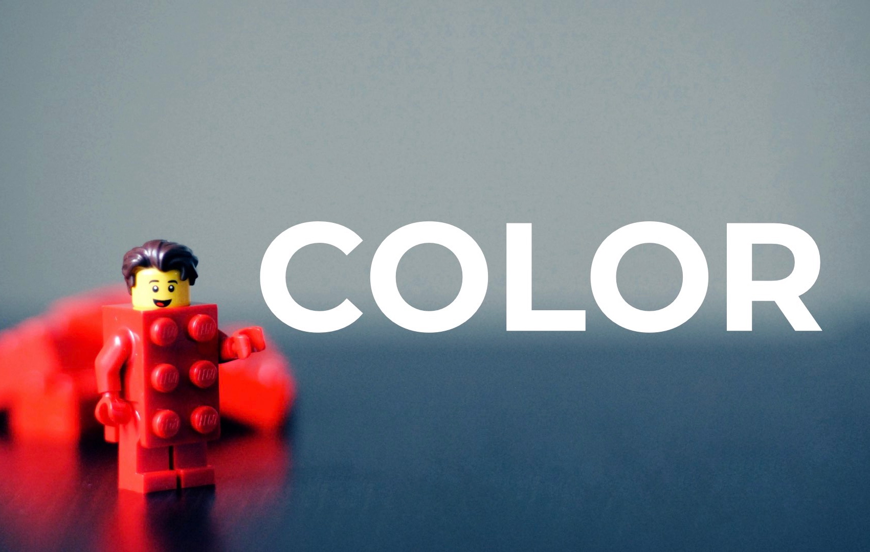
Color
Color is super important and will do a great deal to convey the emotions and intentionality behind your branding. It’s vitally important that you keep your colors and branding consistent, between your branding, your logo, your website, marketing materials, and of course, your pitch deck.
If you haven’t nailed down the details of your brand book, I’d highly encourage you to do so! (And I can help!) Color definitely has a language all its own. First, explore the gallery below to see the various meanings behind colors, along with logos of companies that exemplify those meanings. See if you can match them up! Then you can check out a quick handy video that explains the basics of Color Theory and the many different ways you can create color schemes.
After that, I’ll provide a list of different resources to help you find colors that speak to you, how to find complementary colors, and more!
As you think about color, think carefully about how you’ll need to use your colors. For my own company, I was going to originally choose something much more subdued and simple, maybe a max of three colors. But then I realized two things. One: I wanted to create a very vibrant, inviting, and inclusive environment. Two: I knew I’d have to color code a lot of content in my classes! Thus I knew I’d need far more than just 3 colors. Hence I ended up with 7 primary colors in the form of a rainbow! Sure enough, it’s paid off; I’ve needed to use every last one.
I hope you enjoy this trip through color! If you have any questions, please feel free to ping me and ask!
Color Theory 101
Handy Dandy Color Resources
Adobe Color • Have a color you like? Slot it into the center of Adobe Color, then click between the different color coordination philosophies to find colors that look good with it! If you’re stuck trying to come up with a color scheme, it’s a life safer! It’s not always a perfect color combo, but it will at least get you headed in the right direction.
Canva Color Palette Generator • Canva has gone and created a system based on something we designers have been doing for years! Have you found an image with colors that just speak to you? Maybe it’s a gorgeous landscape, a perfectly designed interior, your favorite painting, or – one of my favorites – something stunning from nature; if it’s a photo, you can base a color scheme off of it! (I do highly recommend turning to nature. Mother Nature has an unsurpassed color sense; you’ll never find a flower, animal, insect, or landscape with clashing colors. I’m especially fond of pulling colors from flowers and peacock spiders!) With Canva’s Color Generator, you can submit that image, and Canva will spit back out a color scheme pulled straight from it! Easy peasy!
Pantone • The grandaddies of color theory! Ever noticed how each season, a bunch of different designers – from fashion to housewares to office supplies to furniture and everything in between – all seem to magically release things in exactly the same color palette? One year it seems like everything is orange, then the next it’s all raspberry pink. That’s because of Pantone. They have huge teams of designers, psychologists, sociologists, historians, futurists, etc, who study cultural trends and determine which colors are likely to resonate within the cultural zeitgeist in any given season. They’re typically eerily accurate! Suffice it to say, they have color down to a science. They have a TON of wonderful resources on their site, between finding out what their “Color of the Year” is (in case you want to go with the trend, or buck it), as well as whole directories of colors. Go exploring!
Choosing Colors for Websites • Here’s a quick handy article that not only summarizes Color Theory, but then talks about how it applies specifically to website development. It’s really handy!
Coolors.co • “The super fast color scheme generator”. This will cycle through coordinating color combos. See a color you like? Click to save it and the rest of the colors will keep cycling. It’s like playing a color slot machine!
ColorHunt.co • Another massive repository of color schemes.
ColorPalettes.net • And another! Want to find more? Just google it! You’ll find tons.
Learn About Color Theory • Want to learn a little more about color theory and the science behind it? I highly recommend it, it’s fascinating stuff! And there have been plenty of bizarre theories about color over the eons. Did you know George Washington painted his dining room at Mount Vernon green because they thought at the time green aided in digestion? We’ve come a long way in understanding color since then!
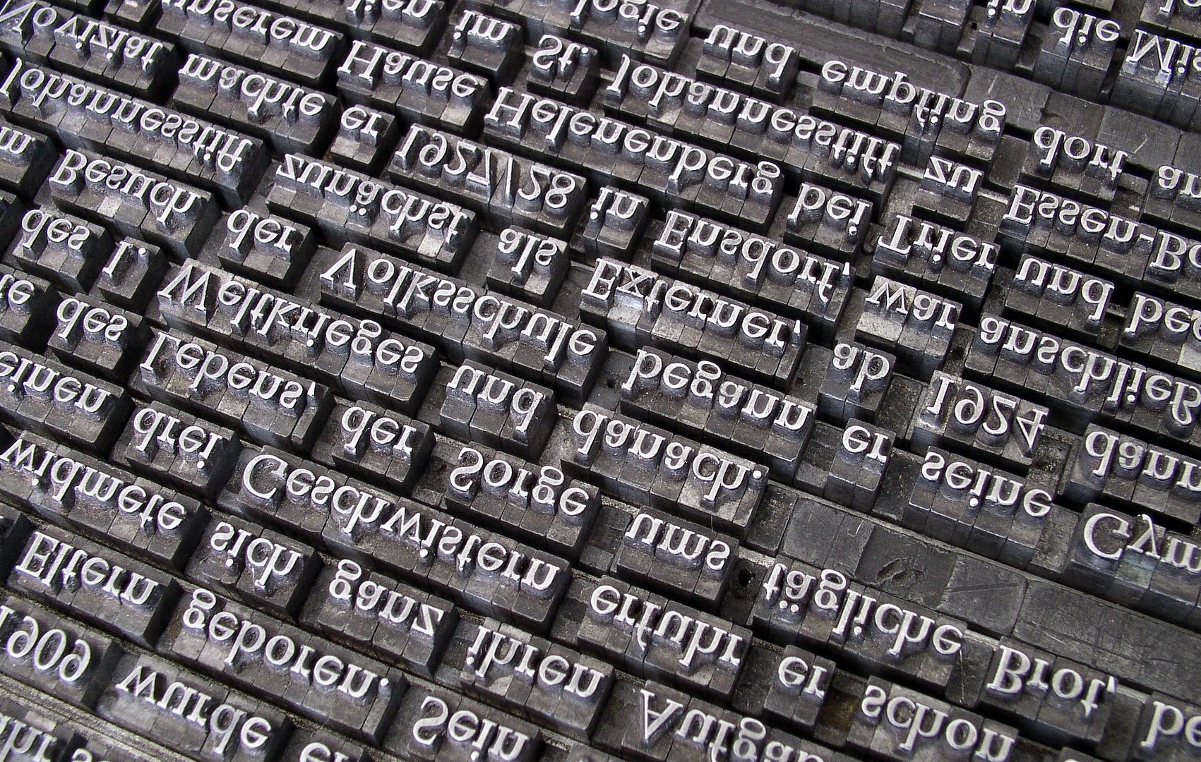
We’ve come a long way from the days of manually set type!
Fonts
Fonts are such an important part of your brand book, your pitch deck, your website; pretty much all of your company’s materials. Think of fonts as the visual equivalent of your tone of voice. Does your company need a voice that commands trust and authority? Or does it need to sound like a friendly & approachable Grandma, ready to hand out cookies & hugs? What would happen if those tones of voice got switched? Cookies & hugs could seriously undermine your authority!
That’s the power – and peril – of fonts. It’s imperative you choose the right ones. Then once you do, you need to remain consistent in your usage. If you don’t, you run the risk of not only appearing inconsistent, but also of being unrecognizeable to your customers & users.
Here I’ll go over some really important information you need to know, both to protect your business from liability, and make sure you’re an ethical consumer. Then I’ll direct you to some of my favorite places to find 100% free fonts, even for commercial use.
Font Types
Fonts come in a variety of styles; think of them almost like species, each with their own name & attributes. There are three main categories that are most important, and two sub- categories you’re less likely to use in a branding scenario.
How many fonts will you need & why? I’ll try to break that down for you, so you’ll know what to look for.
- A Primary Font • Use this for the bulk of your logo, and for attention-grabbing headlines.
- Bulk Text • This is your main work horse. It’ll appear as your slogan and as your bulk text, for all your lovely content. For bulk text you really want to concentrate on finding something easily readable in a wide variety of sizes, that also provides a wide variety of weight options, while still fitting within your overall style. Sans serifs are especially good here, as the vast majority of people find them more easily readable.
- Secondary Font • This is totally optional! Sometimes it can look too busy to have a secondary font, but sometimes it can suit your needs. For instance, I wanted my branding to have a little hint of feminity, but I didn’t want it around all the time. Thus I chose a script secondary font that just pops in for ocassional guest starring roles. If you don’t have a clear cut need for a secondary font, then feel free to skip it!
What is a Serif? As you’ll notice, the two primary categories relate to Serifs, which are little feet-like wings on the bases & edges of letters. Serif fonts have wings, sans-serifs do not. (Hence their name, which literally translates to “without serifs”.)
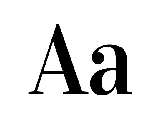
Serif
Serifs are classic, timeless, and depending on the style, can be more traditional. Still, other serifs can evoke specific styles or design eras, even up to modern day. A lot of luxury brands rely on serif fonts. Either way, you can’t go wrong with a good serif!
Sans Serif
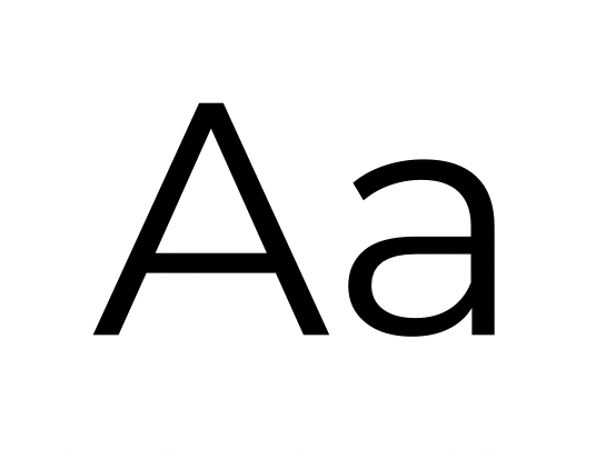
New, innovative, cutting edge; sans serifs tend to be associated with technology, given their rise in popularity alongside the personal computer. They tend to be exceptionally easy to read, so they make great bulk text fonts. Sans serifs tend to look tidy, efficient, and modern.
Script
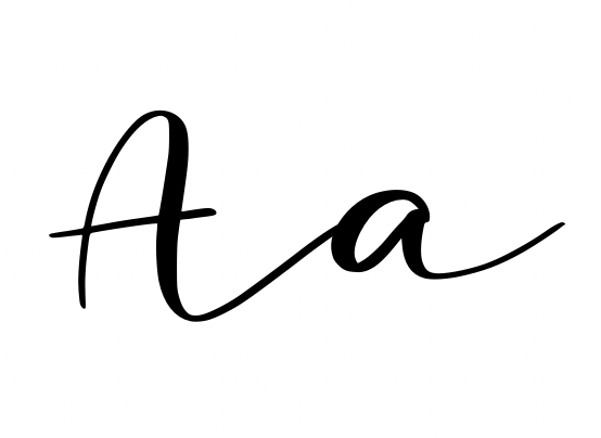
Scripts are also known as Handwriting or Calligraphy fonts, but no matter what they’re called, expect plenty of swooshes & flourishes. While not exactly readable, they do provide elegance, style & grace. Good for logos/headlines, but never for bulk text.
Display
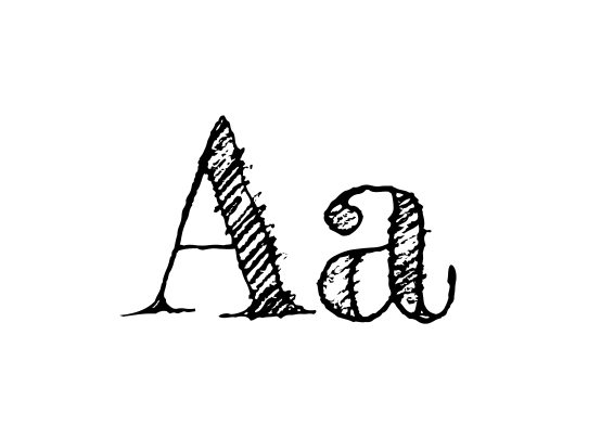
Display is a catch-all; they’re stylized, unique & decorative. They can be great for logos when used carefully, but never for bulk text.
Dingbats
Dingbats aren’t text at all, but rather vector illustrations assigned to letters & numbers. They can be handy as icons, but avoid in logos.
Ethical Type: Font Licenses & You
The vast majority of people don’t think twice about the fonts installed on their computer; where they came from, who made them, the legal in’s & out’s of when or how you can use them. But trust me, designers care. And if businesses aren’t careful, lawyers can start to care too!
Just because a font is installed on your computer, does not mean it’s free to use in a business setting! Fonts are created by specialized, highly trained designers, and I’m sure you’d agree – like all human beings – they deserve to be paid for their labor.
Font designers are paid via something called a Font License. I like to think of it as something similar to movie rentals. Just because you own a DVD of Star Wars, doesn’t mean you can turn your living room into a movie theater, charging for tickets per viewing. When you purchased that DVD, you were purchasing a license that specifically limited the circumstances of viewing that film. If you wanted to rent that movie out, that license would cost more. Want to screen it at a theater? Even more money! Same product, different settings, different costs.
Fonts are exactly the same. For personal use, most font designers don’t care. But if it’s for business use? Where you’re going to start making money off of their education, training, and labor? I’m sure you’d agree, they deserve to be paid.
That’s where font licenses come in. And believe me, font licenses can get expensive! Most font licenses are purchased in different categories, starting with the cheapest:
- Desktop Graphic Design Use, Per User
- Web-Embed, Charged Per 10,000-100,000 Views
- App Embeds
- Mass publication of books, magazines, etc
- E-Book publication
Even just that desktop license can range anywhere from $5 to several hundred! Now imagine you’ve been inadvertently using a font for years in your business, not even aware you should have been paying a license. If you put it on your website – or worse, an app – you could be on the hook for back license fees and penalties that would add up. Quick. Possibly to the tune of tens or even hundreds of thousands of dollars! Nobody has time for that, especially not early stage entrepreneurs.
Which is why I always, always like to educate my clients about font licenses. I don’t want you to be on the hook for that! (And I firmly believe that designers deserve to be paid for their work!)
I know you’re probably stressing out about the potential expense here, but don’t worry! This is why the Design Gods created free fonts!
There are many, many generous font designers out there who believe in open source font design. They’ve created fonts just for the open source market, or donated their back catalogs. And we’re not talking about inexperienced, unskilled font designers here, putting out the leftover scraps! Some of the best typeface designers in history have donated their entire libraries to the open source community!
Free fonts are a lifesaver! There are literally thousands upon thousands to choose from. If you stick with free fonts, you’re free to let as many employees as you want install and use them. You can embed them on y our website, to make sure everything stays cohesive. You won’t have to limit how you use them, so if you ever end up publishing that book or building that app, you have the peace of mind that your branding can continue on.
I’ve compiled a big list of free font repositories over there on the right. Check them out, explore them, find a font that you love! I guarantee, the perfect font is out there. And you can get it. For free.
Free Font Resources
Google Fonts • My absolute favorite & always my first stop. Why? Because they have so many excellent fonts to choose from & they make it incredibly simple to download or even directly embed on your website, all with provided code you can simply copy & paste. Also, if you’re using a website creation service like Squarespace or Wix, chances are they’re already integrated with Google Fonts & you’ll likely find your chosen font already in their design settings.
1001Fonts.com • They have 4,945 fonts entirely free for commercial use. I told you there’d be lots of options!
FontSpace • They have a decent list of 100% free fonts for commercial use.
FontSquirrel • Again, another big long list of free commercial fonts.
Fontesk • And some more!
DaFont.com • This is one of the best and biggest font sites out there, with new fonts being added every week. But you need to be careful, because not every font listed there is free for commercial use. Always double check the font license info that’s just to the left of the download button. If it says “Free for Commercial Use”, “Shareware”, or “Donationware”, you’re good to go! A quick word of caution: because it’s so popular, there are a LOT of dishonest sites trying to appear as them. Their domain names will be close, but not quite. Do not download anything from the copycat sites!
Canva’s Free Font List • Canva put together a nice curated list of some free fonts for commercial use & they’re lovely!
As a busy entrepreneur, when you’re in need of halfway decent imagery for your next project, it can be awfully tempting to head to Google Images and just grab the first image that pops up.
Please resist that urge! Grabbing images without considering whether it’s legal to use them can land anyone in hot water. Just like you wouldn’t plagiarize text, stealing images violates copyright all the same. It’s best to avoid that potentially costly risk by going to the deep wells of Stock Photography.
Believe me, I can hear the groans already. For most of us, stock photography calls to mind painful meme-worthy images, a la Hide the Pain Harold & women inexplicably laughing at their salads. As if the horrible images weren’t bad enough on their own, it adds insult to injury that you typically have to pay for these monstrosities!
I’m here to solve both of those problems for you!
Bad stock photography
has launched over 9,000 memes
There are plenty of websites that offer free, high quality stock images, covering a wide range of subjects. Yes, these images can even be used for commercial purposes! The options are practically endless.
In fact, the vast majority of images used on our own website came from free stock photography websites listed here.
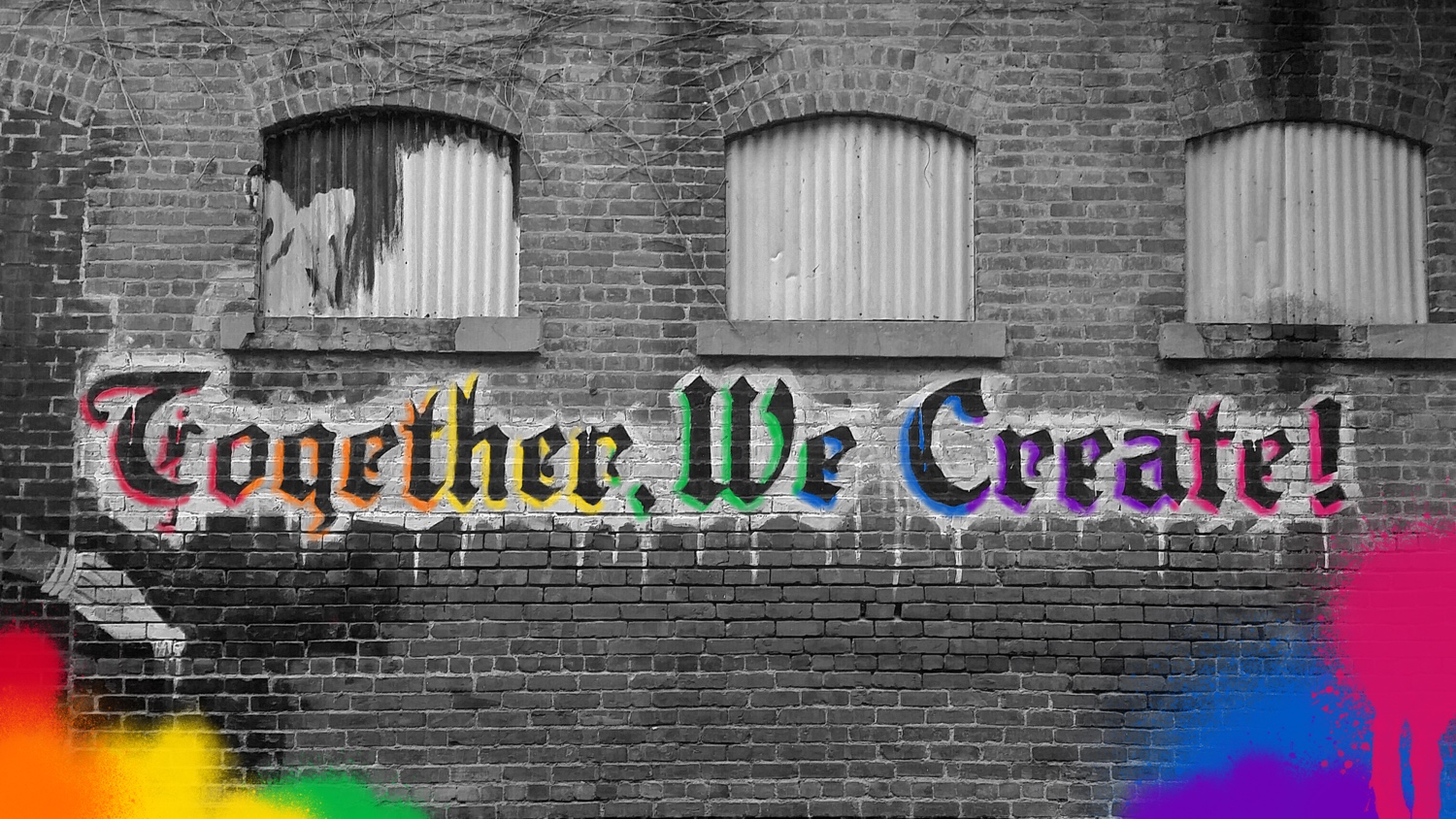
To further enhance your use of free stock imagery, if you have the necessary skills, we highly recommend editing stock photos whenever possible. For instance, that happy smiling woman has been edited so that her lipstick & shirt match the shade of red from our color scheme. The spray painted wall? We edited that very image for use on our Contact page, adding our own rainbow swirls. You can do it too! Paying attention to small details like this, keeping imagery cohesive with your color scheme & overall branding, will truly take your stock images to the next level.
Need a little help integrating free stock imagery into your brand? Give us a shout! That’s what we’re here for & we’re happy to help.
Without further ado, we proudly present
Our Favorite Free Stock Image Resources
Favorites:
Unsplash.com
Unsplash offers thousands of free photos, powered by countless global contributors. A lot of my favorite photos have come from Unsplash!
Pixabay.com
Pixabay is one of the largest stock image repositories out there, featuring photographs, vector graphics, and illustrations.
Pexels.com
Pexels.com is a thriving resource that’s constantly being updated by photographers around the world. I’ve even found some vector illustrations there from time to time.
Icons8.com
Don’t let the name fool you – Icons8 has so much more than icons! They also host a wide variety of stock photos and vector illustrations. The higher res versions do cost money, but they more than make up for that through their amazing tool suite. Look for their Photo Creator & Vector Creator tools, helping you create custom graphics on the fly. On top of all that, their large collection of icons covers a wide range of styles & topics. Best of all, you can customise the colors right there on their website. Icons8 is truly best of the best!
Nappy.co
A wonderful collection of high quality stock imagery specifically of Black & Brown people. Something sorely needed in stock imagery!
StockVault
Another resource that offers stock photos, textures, and vector illustrations.
ReShot
While exploring ReShot’s vast selection of free stock images, make sure you take a look at their top menu. Their sister sites also offer entirely free videos, music, sound effects, templates, and so much more. They’re a total one-stop-shop!
Honorable Mentions:
New Old Stock
Anyone who knows me knows I’m obsessed with antique print. This free resource is basically my version of Nirvana. It’s all antique & vintage photography from public archives, available for free. Go, look, and enjoy the beautiful history!
Gratisography
This amazing site covers both photos and vectors. While it has a slightly smaller archive, what they do have is top notch.
FoodiesFeed
If you’re looking for delectable photos of delicious looking food, look no further!
FreeFoodPhotos.com
Here’s another one that’s the whole foods, all the food, and nothing but the food, so help me, Chef Andrés!
FOCA Stock
This fantastic resource offers not only photos, but also videos and templates, all available for free for commercial use.
Styled Stock
Billing itself as a “Feminine Stock Photography” supplier, Style Stock offers a refreshing response to the predominantly masculine business stock photo space. It does have its share of pink and salads, but also tons and tons of great options showing believable, professional, realistic women in the work place. It’s a great thing to see!
Freerange Stock
An absolutely fantastic collection of both photographs and stunning illustrations! Well worth a visit. Or two!
Best of the Rest:
- Albumarium
- Barn Images – Not just photos of barns after all
- Burst by Shopify
- FreeImages.com
- FreeStocks.org
- ISO Republic
- Jay Mantri – Great shots, but some high res photos cost $0.99.
- KaboomPics – Kaboom it!
- Life Of Pix
- Little Visuals
- Negative Space
- PicJumbo
- Picography
- PicSpree – Stock Photos, Illustrations & Vectors
- PikWizard
- SkitterPhoto
- StockSnap.io
Happy image hunting!

Design elements are a lot like humans; we like our breathing room!
Margins
It may sound counterintuitive, but so much of design is about what’s not on the page! The space up & down, side to side, and in between is vitally important to the design process. These are known as margins, the mathematical distances between elements. Those blank, empty buffer areas are known as “Negative Space”. It may sound like a real downer, but trust me, it’s a happy thing!
Think of design elements like people; we all like our breathing room! Just like humans on a crowded subway car, no one enjoys being crammed into a cramped, confined, teeny space. Design elements are exactly the same; give them space the breathe. Better yet, keep those breathing spaces even, balanced, and well thought out.
That’s the foundation of margins! Providing breathing room that’s balanced, mirrored, and symmetrical as much as possible. In this section I’ll tell you a little more about how to achieve balance, as well as link you to some tools to help.
The Golden Ratio
Your Guide to Perfect Margins

Just about everyone gets nervous before public speaking! For entrepreneurs, there’s the added pressure of knowing your dreams are on the line. …Yay! (Ugh.) But trust me, you can do this!
Overcoming Nerves
Just about everyone gets nervous before a pitch presentation. Nerves themselves aren’t a bad thing; it’s proof how much you care about your venture. The trick is to learn how to lessen the power nerves have over you by:
- Practicing until your pitch feels comfortable and natural,
- Tailoring your pitch to suit your personal style,
- Utilizing whatever mental techniques work best for you in order to make your nerves work for you rather than against you.
In this section I’ll share what’s worked best for me and my clients in helping all of us to overcome the inevitable stage fright we’ve all had to face when walking into a pitch competition or investor’s meeting. Remember, it’s proof you care! Now let’s make sure all that caring gets put to good use.
Pitch Practice
Believe me, I’ve been an entrepreneur enough times to know that you’re always busy, you’re always trying to deal with a new crisis, and your hair is pratically always on fire. Knowing that, I know you’ll hate what I’m about to say. But it’s the truth.
You need to practice your pitch at least 8 times before it starts to feel natural. The more you practice, the more the nerves will subside & the better your pitch will be.
That may sound like a lot, but if your pitch is only 3 minutes long, running through it 8 times will take you all of 24 minutes! Please, invest the time. Invest the time not only for yourself, but for your business. I promise, it will pay off!
I’d also highly recommend you practice your pitch in front of friends, family, and – if at all possible – fellow entrepreneurs. Keep an open mind, be welcoming of kind critiques, accept only the advice that both challenges you but also feels right, and you will improve.
Tailoring Your Pitch
I’ve noticed there are plenty of different styles when it comes to pitching. The main differences I’d like to go over have to do with pitch formulation & preparation.
Are You Scripted, Or Not?
Generally speaking, I always highly, highly recommend that my clients develop script and stick to it as much as possible. Planning ahead in that much detail – especially when you’re facing pitches with tight time constraints – will ensure that you make the absolute most out of each precious second. But in working with my clients, I’ve notice there are some inevitable drawbacks with scripts.
First, for a lot of entrepreneurs, reading from a script inevitably leads to feedback that they should “go off script” to “sound more conversational.” This feedback makes me chuckle every time! I know they mean well, but I think it’s terrible advice. Why? Because they’re reacting to a symptom, rather than a cause.
The problem there isn’t that they’re on script. The problem is how they’re reading the script. If you’re not sounding conversational, it’s likely because your voice is too flat or monotone; that’s not a script problem, that’s a problem of vocal tone, cadence, and modulation.
Next time you’re hanging out with your closest friends, pay attention to how everyone speaks. How you speak. I guarantee that when you’re at your most comfortable, you will notice a lightness to your voice, a constant gentle rise & fall to your intonation. Some people even say that when someone smiles, they can hear it in their voice. That’s what investors are missing when they react by saying you need to “go off script”! So if you’re coming across as cold or robotic, try to mimic the way you speak when you’re surrounded by your closest friends. Perhaps even watch a few videos about voice acting on YouTube to get some pointers about ways to control your tone and modulation.
I’ve always been a strict adherent to scripts. Yet I’ve never once been told I’m “not conversational enough”. I’ve attended countless pitch practices for almost ten years; I’ve only ever heard “you should go off script!” when the delivery was monotone. If you are hearing that advice, it’s not your script, but it is fixable! You can do it!
What if You Absolutely Hate Having a Script?
Trust me, I’ve seen my fair share of entrepreneurs who simply do not flourish when they have to pitch from a script! Putting them on script is like sticking them in a cage; they start to feel rigid, uncomfortable, and just plain not themselves. I get it! If that’s you, that’s totally fine.
But before you decide to jump off script, I want you to ask yourself one question & think about it honestly: is your hesitation about scripts due to a natural inclination… or feeling overworked when it comes to preparation?
If it’s because you’re feeling burdened at the thought of prep time, going off script will not help you. Believe me, as an entrepreneur many times over, I understand burn out! But avoiding practice will only make things worse in the long run. If you want to get investment, if you’re developing a pitch deck, you absolutely have to practice. Think of it as an investment in your future, just as much as any other part of building your business. If you can’t tell your story, it’ll make convincing others to join you that much harder!
If you’re simply not a script person, that’s totally okay! There are plenty of other ways you can prepare. I’ve often helped these types of folks prepare by utilizing outlines organized like a bulleted list. I’ve even created some where there are little thumbnails of each slide, with a bulleted list of the top 2-to-3 points they need to make next to the relevant slide. That little teeny bit of structure is usually just enough to keep them on time, keep them from rambling, and ensure they don’t forget to convey important details. So if you’re chafing at the restraints of a script, give that a try instead!
To Transition or Not to Transition; That Is The Question
Another key aspect of pitch preparation has to do with animated transitions. Personally, I’m a huge fan of them! The artist side of my brain truly enjoys using every tool in my kit to engage the audience, transforming pitch decks into cinematic experiences. Naturally, animated transitions should always, always be subtle! Again, the point of every pitch is to focus the audience’s attention primarily on the speaker, not on whiz bang special effects going on in the slide deck. But a tasteful dissolve here, a bit of motion to illustrate a graph; they can add impact, make key details more memorable, and help you stand out from the crowd.
But. Some entrepreneurs just clash with transitions. They can’t get the timing right, don’t want to deal with the distraction, or they just flat out don’t like them. Again, that’s okay! If that sounds familiar, it’s 100% okay to skip the transitions and keep things simple.
The only exception I will make to that rule is when it comes to building in elements one at a time when you have to explain a complex slide. If all the information being presented has to be on one slide, then please, build it in bit by bit, so the audience doesn’t read ahead or get overwhelmed. You don’t need an animation to build it in! But please, keep your audience’s comfort in mind as well as your own; don’t give them any excuse to distract their attention away from what you’re trying to tell them.
Comfort is the Key to Perfection
Ultimately, making a “perfect” pitch deck is all about finding out what “perfect” means to you. A big part of my job is about helping you discover ways to make sure the deck serves you, rather than distracts you. Think carefully about what annoys you most when delivering a pitch; is there a way to eliminate – or at least lessen – that annoyance? Anything you can do to make the process feel more natural for you will go a long way toward helping to overcome those dreaded nerves!
Comfort also applies to the pitch environment as well. Believe me, I learned that lesson the hard way! While I was a fellow with the Halcyon Incubator, I fell and my left ankle was fractured quite badly. My doctors stuffed me into a huge heavy boot cast, but I was determined to continue the program. At my very next pitch practice session, they offered me a chair, but… everyone else was pitching standing up. A guest lecturer had told us we should always pitch standing, to “command the stage”. Steve Jobs always pitched standing! Thus I declined the chair & soldiered on.
Huge. Mistake. Only a few minutes in I could feel my leg swelling. The pain was overwhelming. I was mortified, embarrassed, and in absolutely agonizing pain. It finally got so bad that I was having difficulty breathing. Yet still, I kept pitching!
Thank God, finally the program director interrupted me and said, “Heather, I think you need to sit down.”
I finally took a seat, but I insisted on finishing my pitch. It was a complete disaster. Thankfully it was only a pitch practice and not a real pitch, or I would have been sunk. (Actually. A similar story happened once during an honest-to-goodness pitch, involving an allergic reaction I somehow managed to hide until I was done, but still… Worst. Pitch. of. My. Life! Needless to say, I did not get the investment.)
The moral of the story is, do whatever you need to do (within reason!) to be as comfortable as possible while pitching. Plan your pitch to suit your natural inclinations, and when it comes time to pitch, for the love of Mr. Wonderful, if you need to pitch sitting down, sit down! When you are at your most comfortable, you’ll find that the nerves quiet down considerably.
(I do, however, draw the line at pitching in pajamas, gym shorts, or stained clothing. Yes, I’ve seen that in real life too. Make sure your own comfort is always balanced against looking appropriate for the occasion, because you want to make sure to show respect to your audience!)
Techniques to Address Nerves Head-On
Even if you’ve tailored your pitch to your specific style & practiced it more than 8 times, you’ll likely still feel some degree of nervousness leading up to a big, important pitch. Your preparatory efforts will most certainly lessen their severity, but nerves are inevitable. So what can you do to knock them down another peg or two? Here are a few mindfulness techniques my clients & I have found helpful over the years. I hope they help you too!
Box Breathing
If you find yourself getting hit with a bad case of the butterflies right before the pitch & need something quick, quiet, and calming, I highly recommend Box Breathing! It’s basically a fancy name for a quick four-part breathing technique used by Navy SEALS:
- Breathe in slowly through your nose for 4 seconds.
- Hold your breath for 4 seconds.
- Breathe out slowly through your mouth for 4 seconds.
- Hold your breath for 4 seconds.
- Rinse & repeat.
It’s backed up by some pretty rigorous, basic science. Breathing deeply into your diaphragm helps to rush oxygen into your bloodstream faster. Controlled slow breathing also helps to push your body back into the parasympathetic nervous state, helping to pull you back out of Fight or Flight mode being triggered by your anxiety. Overall it’s a good, quick, easy thing you can do before any pitch to help calm your body down!
Here’s a guided YouTube video of the technique, if you’d like to give it a try: https://www.youtube.com/watch?v=FJJazKtH_9I
Manifesting a Positive Outcome
I’m not generally a very spiritualistic person, so this is quite a departure for me. But over the past year or so, I’ve transitioned from setting goals to instead adopting a practice called Manifesting. It’s very similar to goals, but with an ever so slight shift in intention and perspective. I’ve found it immensely helpful, so I thought you might find it helpful too. If it’s not for you, though, that’s okay!
Setting a goal would look something like this: “I want to pitch to ten investment groups & secure an investor for my company.”
Manifesting would take the same idea, but instead present it like this: “I will pitch to receptive, well-suited investment groups, at least one of whom will become a successful investment partner to champion my company.”
To me at least, goals feel very action-oriented, while Manifesting goes a step further. It not only details the action, it continues the logic through to a desired & detailed outcome. It reminds me of a common phrase my Mother always used to say throughout my childhood, “Follow the logic train all the way through to the station.”
In other words, think it all the way through to the end. Manifesting does that for me. It not only helps me to see what I need to do, but helps me to imagine the best possible outcomes from those actions. It has helped me to see other possible paths to my desired destination, helped me to examine problems from other perspectives. But most of all, the longer I’ve carried on this practice, the more I’ve noticed a broadening of my own desires.
For the past year, I’ve tried to “Manifest” at least once a week, each time declaring one thing that will happen for each segment of time:
- Tomorrow
- Next Week
- Next Month
- By the end of the Year
Again, it’s following that logic train all the way through to the station. Say you pitch to those ten companies and you get that investor; what happens next? And after that?
It’s a long-view approach to your life, but without all the stress and pressure of a detailed roadmap. It’s permission to let your heart dream and your mind wander. The more I’ve done it, the more I’ve also started to focus not necessarily on what I “want”, but what I truly “need”. My original manifesting journal is full of mundane, every day things like, “This client will pay me tomorrow,” or “I will finish this pitch deck this week.” It slowly, bit by bit, without me even realizing it at the time, morphed into, “This client will pay me when they are able to,” and “I will be happy and rested while managing to finish my work.” I truly think it’s the difference between focusing on the action versus focusing on the outcome. The more I’ve focused on the outcome, the more I’ve been able to find calm and be at peace with the actions I’ve taken to get where I want to go.
For the matter at hand of nerves, it’s been an absolute life-changer. Focusing on the outcome has changed my nervousness about the immediate action at hand. It also creates such an air of positivity; you aren’t just hoping for an action that might happen. Instead, you’ve put the idea in your head that it will happen. Yet again, a slight shift in perspective that makes all the difference in the world. Suddenly the outcome isn’t nebulous and scary and anxiety-producing. It’s already been written, it’s already taken on a positive hue in my mind’s eye; suddenly the pressure about what might happen or the worry that I might mess it up just dissipates.
I hope you’ll give it a try and see if it helps you too! Good luck!
Tapping The Nerves Away
Another fellow from the Halcyon Incubator recently introduced me to a technique called Body Tapping. I’ve recommended it to a few clients already and they’ve had really positive reactions to it! It’s a little more involved than Box Breathing, but it seriously feels like you’ve had a massage by the time you’re done. I found a helpful YouTube tutorial for it, but the one thing I’d change based on my friend Samier Mansur’s instructions: put on a happy song with a beat you can’t help but dance to! When he taught us how to do it, he put on Pharrell Williams’ ‘Happy’ and it was perfect!
Here’s the tutorial: https://youtu.be/UacJm2AM5U0
"This Is My House"
This is an oldie but a goodie! Way back in 2014, I was a fellow in the inaugural cohort of the Halcyon Incubator. It’s a very unique program; its headquartered inside a gigantic historic mansion in Washington, DC. Part of the house and the adjacent townhome is split into apartments, which the fellows live in during a 6-month-long Residency Phase. At the end of the Residency, the home’s massive ballroom hosts a Showcase event where all the fellows get up and deliver pitches in the hope of getting investors.
I was a nervous wreck. None of my other ventures up to that point in my life had gone through a typical investment process; I was a dyed-in-the-wool bootstrapper. I’d made a lot of progress during the program, but I was still unbelievably nervous and dealing with a lot of Imposter Syndrome.
The night before Showcase Day, another fellow and I stayed up ridiculously late, practicing in the ballroom. At one point, as the nerves got to be a bit overwhelming, I had an idea. I stood at the lecturn, put my hands on it, closed my eyes, and repeated something over and over in my head.
“I’m in my house. I’m in my bedroom. I’m in my happy place. I’m safe. I’m about to do my favorite things. This is my house. This is my bedroom.”
It started to work, so I decided to open my eyes back up and just walk back and forth, on and off the stage. I was petrified I was going to trip, as I was still recovering from a badly broken ankle at the time. Each time I walked up the steps, I repeated in my mind, “I’m walking into my bedroom. This is my house.”
I hoped that muscle memory would take over and help calm me down, kind of seeping in the same feelings of comfort each time I get whenever I come home, or go into my bedroom to lay down for the night. It definitely felt like it helped, as during the event I didn’t trip when I went up the stairs, I delivered my pitch remarkably well, and everything went just fine.
If you’re really desperate for something to calm your nerves, maybe give my little made up practice a try!
Good luck!! Remember, you can do this. You know your business, you’ve attempted something few people have the guts to try, and you’ve accomplished a lot. Only a simple pitch stands between you and the next stage of your journey to success. That’s nothing compared to everything you’ve already accomplished! So get out there and make it happen.

“Tell me a fact & I’ll forget. Tell me a story & I’ll never forget.”
Pitch Frameworks
Pitch decks are a lot like books in a multitude of ways. First, it’s simply a different & unique medium through which you’ll tell a convincing story of a Hero’s Journey; one that you hope will convince others to share in that journey with you.
Second, pitches also very much rely on a kind of chapter structure; a guide to not only walk your audience through your tale, but also a handy format you can follow to help you develop your pitch.
There are a multitude of pitch frameworks out there, but I thought I’d share my two favorites here. One is of my own design, the other is a 3-Minute Pitch Framework I’m fond of using whenever clients are having a particularly difficult time squeezing everything they want to say down into a 3-minute pitch.
But as always, please feel free to google for more pitch deck frameworks; there are plenty out there! Find one that suits your style and helps you to convey all the key points of your business.
Heather’s Pitch Story Structure
I developed this from the perspective of a writer, attempting to analyze the story flow of a pitch deck. I wanted to build a compelling argument with a clear and logical through-line. This was what I came up with. I find it especially works well for pitches 4-to-7 minutes long, as it does tend to encourage a slightly deeper dive into story-like details. One thing I do recommend you always apply to any other framework regardless of length, however, is the final step. Concluding with gratitude is always necessary if you want to leave the audience with the best possible impression!
1 - Intro
Who are you, what’s your title within the company, what company do you represent, and a one sentence summary of what your company does, e.g. “Hello, I’m Heather Lawver, I’m the Founder &
President of Perfectly Pitched. We support early stage social entrepreneurs with their branding, marketing, and pitch deck needs.”
2 - A Compelling Problem
What problem(s) are you solving? Be mindful that whatever problems you introduce will need to be clearly & obviously solved later. Give the audience an idea of how big that problem is. How many people does it affect? What costs are involved? This helps investors understand the potential market size & growth potential for your specific solution. Above all else, don’t just quote facts & figures at the audience. Make your problem feel human. Make it emotional. Give them a human being to connect to, empathize with, relate to. If you can do that, they’ll be far more likely to care & far more likely to invest.
3 - Your Unique Solution
What is your venture, how does it work, and whom does it serve? This is a ‘Wizard of Oz’ moment, where the stark black & white world of the Problem is suddenly solved with a big technicolor array
of hope & optimism for a perfect future, once everyone joins you on the road to success.
4 - Market & Financials
How have you made money? What are the figures like? How big is the market size & potential? Who else occupies the same market segment as you? How are you better? How will you continue to grow & become even more profitable? What have you accomplished thus far? How many customers? How much money have you made?
Anything you can show to demonstrate accomplishments & traction with your intended customers. What do the next few years look like? What are your goals & what will you need to reach them?
5 - Why Now, Why You?
Why is now the right time to take action? If they don’t jump in & invest right now, what will they miss out on? And why are you the person, or the team, to make it happen? When someone invests, they’re not just investing in an idea on its own in a vacuum. They’re investing just as much — if not moreso — in the person they believe can make that idea a reality. Convince them you are that person!
6 - Your Ask For Your Future
Your entire narrative argument should be made by now. They should know what they’re buying before you ever put a price tag on it. What’s more, they should already be convinced & excited to dive in! They should know what goal you’re trying to reach, now all they need to know is what resources you need to make it happen. Tell them! Make the ask! No matter where you’re pitching or why, always — always — have an ask. But it doesn’t have to be money! Just ask for whatever it is you currently need.
7 - A Grateful Crescendo
After all of that, don’t forget to conclude with what I like to call a “Grateful Crescendo”. In a line or two, hearken back to the feelings that made your problem/solution narrative compelling. Conclude by painting the picture of how amazing it will feel if you could solve that problem together! Show them how much better off the world will be because of what you could do together. Then conclude with an earnest thank you over your logo, name, and contact information. Easy peasy! You can do this!
The 3-Minute Pitch
I wish I knew who to credit for creating this wonderful little pitch framework! Sadly I haven’t had any luck trying to find out. Suffice it to say, this is one of my standard go-to frameworks. I’ve added some of my own flourishes to help flesh out the descriptions a bit, to help give my clients a little more assistance.
For each section, add no more than 1 to 3 bullet points that you’ll need to cover. Some sections will only require 1 (e.g. Intro), while others will need 3. You are allowed only 1 section with 4 bullet points! Typically that’s your Business Plan. If you stick to that formula, you should come in at just about 3 minutes.
- Intro • Your name, your title, your company, and a one sentence slogan describing what your company does.
- Problem • What problem(s) are you solving? Be mindful that whatever problems you introduce will need to be clearly & obviously solved later.
- How big is the problem? • How many people does it affect? Are there costs involved? This helps get people thinking about potential market size and growth.
- Solution • What is your venture, how does it work, and whom does it serve?
- Benefits • How are you clearly & obviously solving the aforementioned problem(s)? Paint a picture of how wonderful the world will be when you’re super successful & have achieved your goals.
- Business model • How have you made money? What are the figures like? How big is the market size & potential?
- Competitors • Who else occupies the same market segment as you? How are you better?
- Go to market/Scale strategy • How will you continue to grow & become even more profitable? Investors need to see how & when they’ll make their money back.
- Progress • What have you accomplished thus far? How many customers? How much money have you made? Anything you can show to demonstrate accomplishments, traction, and market acceptance.
- Simple projections • What do the next few years look like? What are your goals?
- Team • Who are you, who’s your team, and why are you the best person/team to accomplish this?
- Ask • Now that you’ve made the awesome case for your company, what do you need to accomplish your goals?
- Closing summary & gratitude • Thank them earnestly and give them one last quick summarizing reminder of who you are.
Building A Better Future
It’s been difficult stepping away from consulting, but we’re excited about our plans to build a better solution for founders at scale. If you’d like to be kept up to date on what we’re building, make sure you sign up for our newsletter!
Get in Touch
If you have any questions, we’re just an email away!

